
Safety rules are everywhere, and that is exactly why people stop seeing them. SAFETYOU makes them personal again: it speaks to you, about you, in the place where you work.

Franz Boccalatte
CEO & Founder
Safety rules are everywhere, and that is exactly why people stop seeing them. SAFETYOU makes them personal again: it speaks to you, about you, in the place where you work.
Franz Boccalatte
CEO & Founder
Laminazione Sottile is one of Italy’s leading names in aluminium lamination, with more than 1,200 people working across its plants. In an industrial company safety is never a side topic: it is the condition for everything else. The company asked us for a single identity able to carry all of its safety communication, from the poster at the gate to the screens on the shop floor. We designed SAFETYOU.
Laminazione Sottile is one of Italy’s leading names in aluminium lamination, with more than 1,200 people working across its plants. In an industrial company safety is never a side topic: it is the condition for everything else. The company asked us for a single identity able to carry all of its safety communication, from the poster at the gate to the screens on the shop floor. We designed SAFETYOU.

Creative challenges
The first challenge was the name. Safety communication usually talks about procedures; we wanted it to talk about people. SAFETYOU joins two words, Safety and You, and says in one breath what the whole program stands for: safety concerns you, and you are the one who makes it happen.
The line “Every day, Every time” closes every message like a seal. Around the name we designed a visual system borrowed from the language of industrial signage and brought up to date: a monogram built from the letter S, the bold shapes of Nokia Expanded paired with the clarity of Acid Grotesk, and a palette of four colours, Safe Red, Industrial Grey, Hazard Black and Warm White.
Creative challenges
The first challenge was the name. Safety communication usually talks about procedures; we wanted it to talk about people. SAFETYOU joins two words, Safety and You, and says in one breath what the whole program stands for: safety concerns you, and you are the one who makes it happen.
The line “Every day, Every time” closes every message like a seal. Around the name we designed a visual system borrowed from the language of industrial signage and brought up to date: a monogram built from the letter S, the bold shapes of Nokia Expanded paired with the clarity of Acid Grotesk, and a palette of four colours, Safe Red, Industrial Grey, Hazard Black and Warm White.


The strategic approach
Safety messages fail when they sound like a manual, or when they try to scare. SAFETYOU does neither. Every message is a short instruction followed by one line that says why it matters to you: wear your helmet, you are the one stepping onto the line. No fear, no blood, no statistics used as a threat. Everyday objects, a helmet, a step, a crossing, become the starting point for a message that speaks to the person, and to the colleague working next to them.
The identity lives on posters, banners, floor signs, tapes, helmets, vests, manuals and screens, always recognisable and never in conflict with mandatory safety signage. It was built as an umbrella brand, ready to host new formats and to grow with the company. Because safety is a habit, and habits are built every day, every time.
The strategic approach
Safety messages fail when they sound like a manual, or when they try to scare. SAFETYOU does neither. Every message is a short instruction followed by one line that says why it matters to you: wear your helmet, you are the one stepping onto the line. No fear, no blood, no statistics used as a threat. Everyday objects, a helmet, a step, a crossing, become the starting point for a message that speaks to the person, and to the colleague working next to them.
The identity lives on posters, banners, floor signs, tapes, helmets, vests, manuals and screens, always recognisable and never in conflict with mandatory safety signage. It was built as an umbrella brand, ready to host new formats and to grow with the company. Because safety is a habit, and habits are built every day, every time.


Latest projects
Branding
Naming
Motion Design
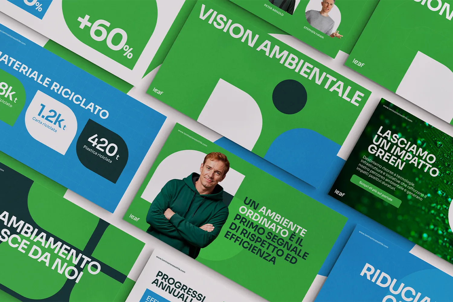
LEAF — A Sustainability Culture That Takes Root
An internal brand experience built to make sustainability a shared value across 1,200 employees — one leaf at a time.
Branding
Naming
Motion Design
LEAF — A Sustainability Culture That Takes Root
An internal brand experience built to make sustainability a shared value across 1,200 employees — one leaf at a time.
Branding
Naming
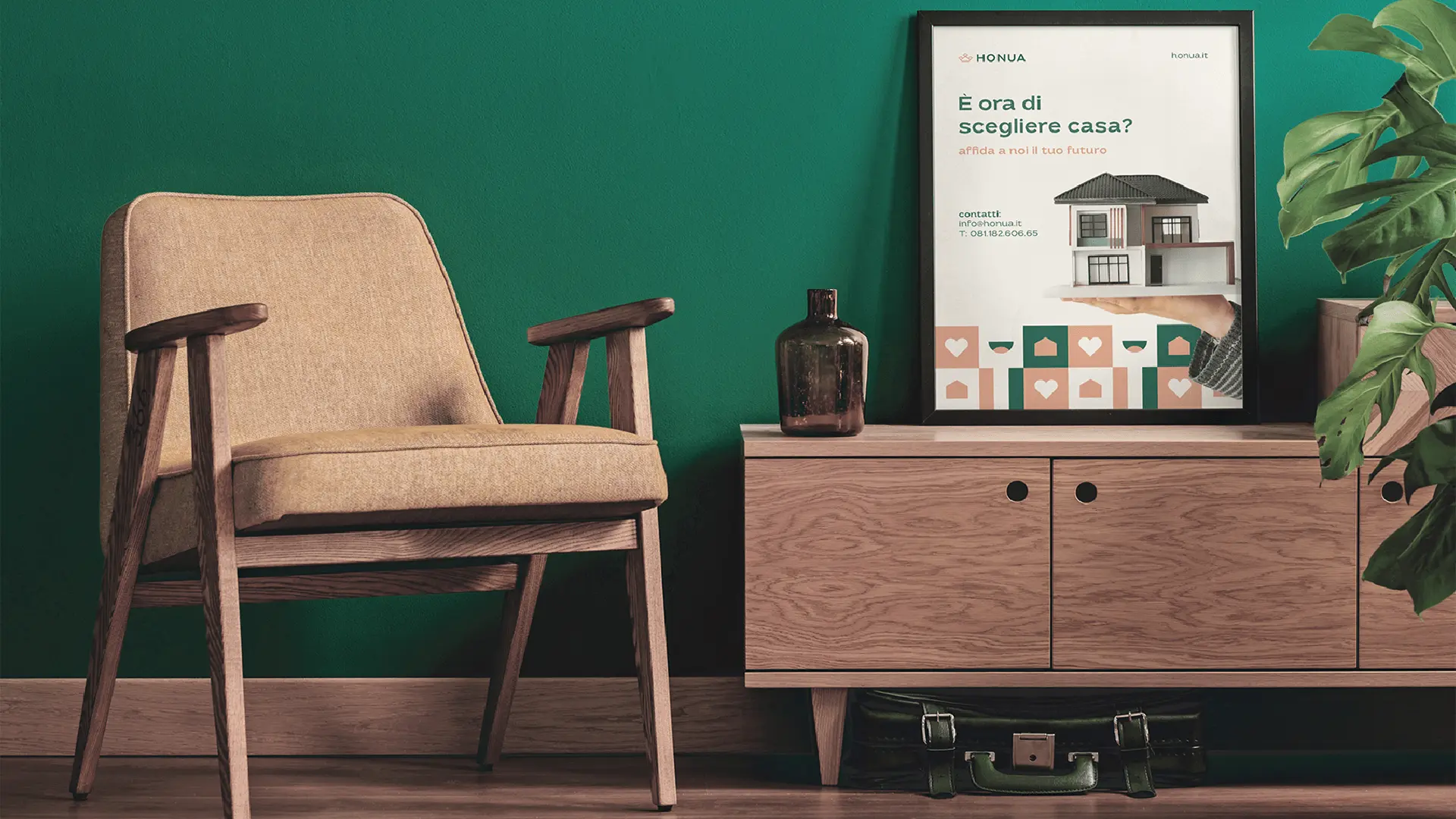
Honua — The Real Estate Agency You Can Trust
Complete brand identity for a new real estate agency built on 20 years of experience and one simple idea: honesty.
Branding
Naming
Honua — The Real Estate Agency You Can Trust
Complete brand identity for a new real estate agency built on 20 years of experience and one simple idea: honesty.
Latest projects
Branding
Naming
Motion Design
LEAF — A Sustainability Culture That Takes Root
An internal brand experience built to make sustainability a shared value across 1,200 employees — one leaf at a time.
Branding
Naming
Honua — The Real Estate Agency You Can Trust
Complete brand identity for a new real estate agency built on 20 years of experience and one simple idea: honesty.
