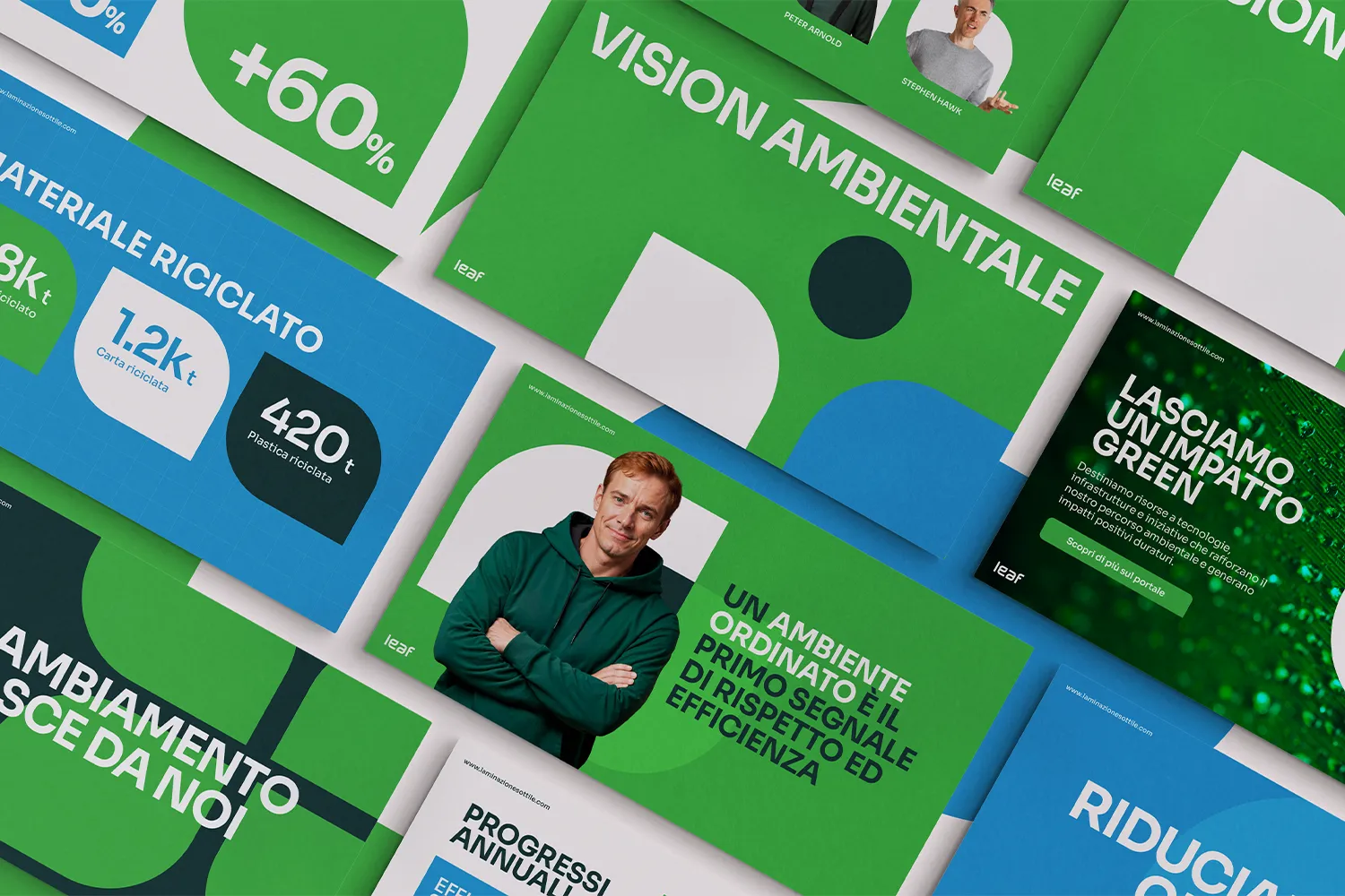
Laminazione Sottile wanted sustainability to become culture, not a slogan. We gave that ambition a name, a face, and a language its people could rally behind.

Franz Boccalatte
CEO & Founder
Laminazione Sottile wanted sustainability to become culture, not a slogan. We gave that ambition a name, a face, and a language its people could rally behind.
Franz Boccalatte
CEO & Founder
Laminazione Sottile is one of Italy's leading names in aluminium lamination — a company with deep industrial roots and a clear ambition for its future: to make sustainability something every person on the team feels and owns. With more than 1,200 employees across the country, that called for more than a campaign. It called for a brand people could believe in and belong to. So we built one.
Laminazione Sottile is one of Italy's leading names in aluminium lamination — a company with deep industrial roots and a clear ambition for its future: to make sustainability something every person on the team feels and owns. With more than 1,200 employees across the country, that called for more than a campaign. It called for a brand people could believe in and belong to. So we built one.
Creative challenges
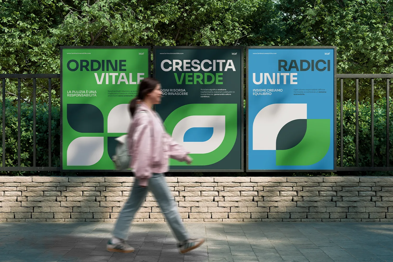
Together with Laminazione Sottile, we created an internal brand designed to make sustainability tangible, human, and genuinely worth caring about. Naming was the heart of the project. We looked for a word that felt natural in any language and carried meaning on more than one level.
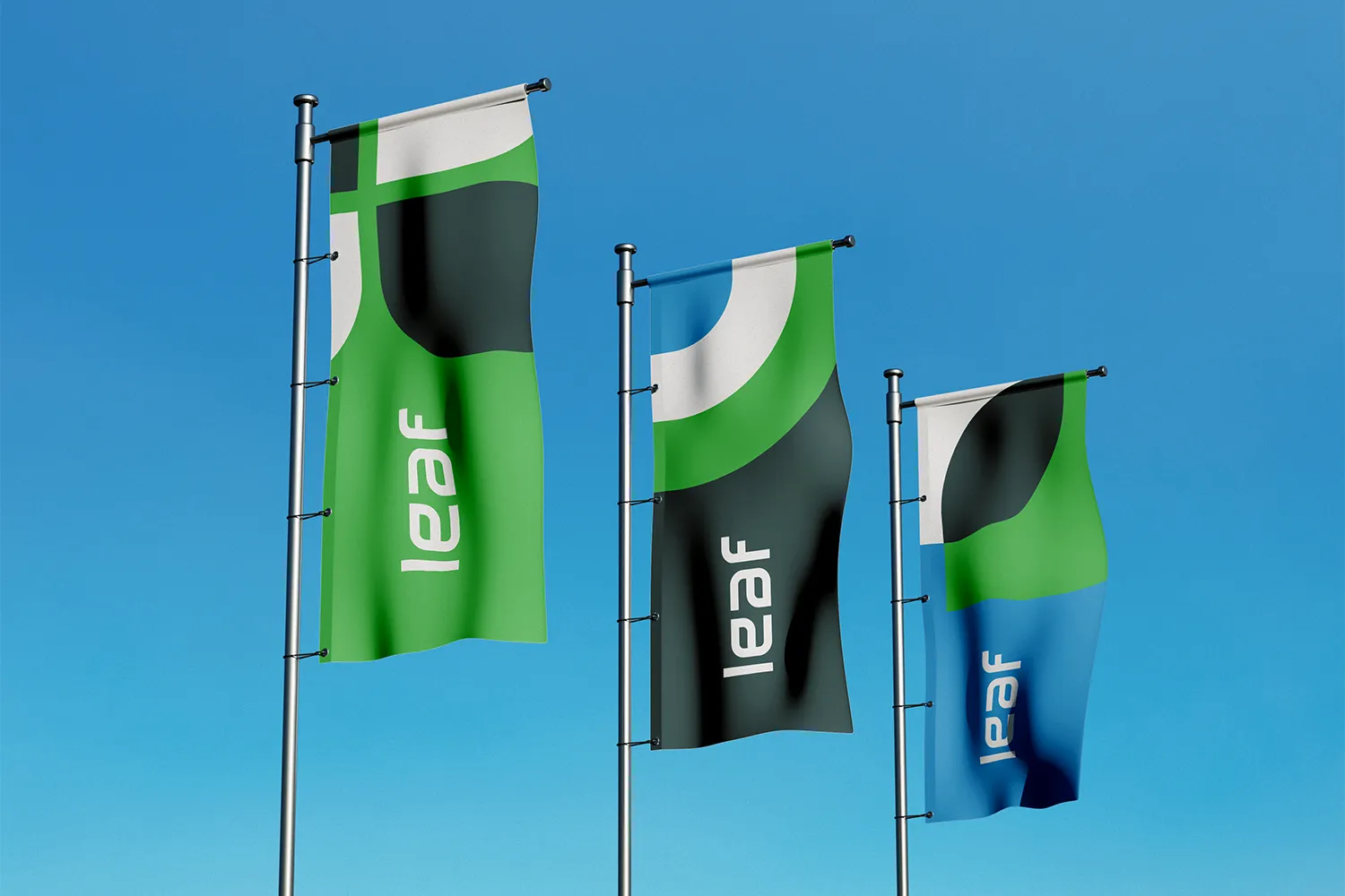
LEAF was the answer: a leaf — the smallest unit of growth in nature — and an acronym for the program's four pillars, Laminazione, Ecologia, Ambiente, Futuro. From there we developed the full identity and a narrative system designed to grow in stages, from the first internal kick-off (the seed) to a self-sustaining culture (the forest).
Creative challenges
Together with Laminazione Sottile, we created an internal brand designed to make sustainability tangible, human, and genuinely worth caring about. Naming was the heart of the project. We looked for a word that felt natural in any language and carried meaning on more than one level.
LEAF was the answer: a leaf — the smallest unit of growth in nature — and an acronym for the program's four pillars, Laminazione, Ecologia, Ambiente, Futuro. From there we developed the full identity and a narrative system designed to grow in stages, from the first internal kick-off (the seed) to a self-sustaining culture (the forest).


The strategic Approach
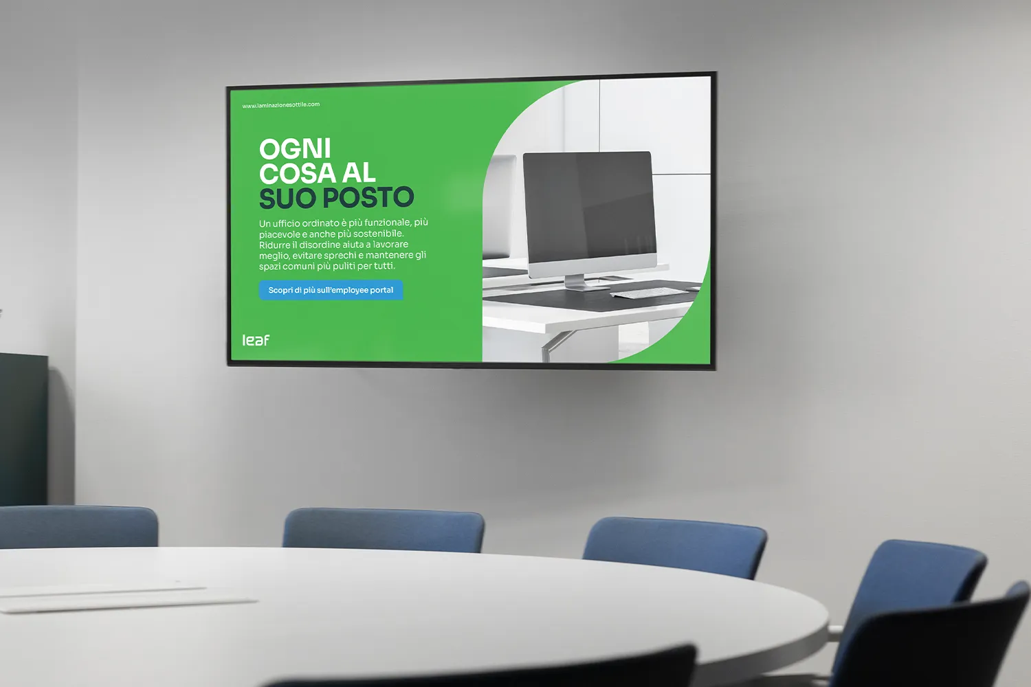
All of this had to translate into an identity that felt like growth, not obligation. Internal sustainability programs often fail because they preach — LEAF was built to invite instead. Every decision, from the Sora typeface to a palette of radical green, oceanic turquoise and deep blue nature, was made to feel modern, clean and alive, deliberately steering clear of the tired clichés of corporate green communication: no stock recycling bins, no staged smiles.
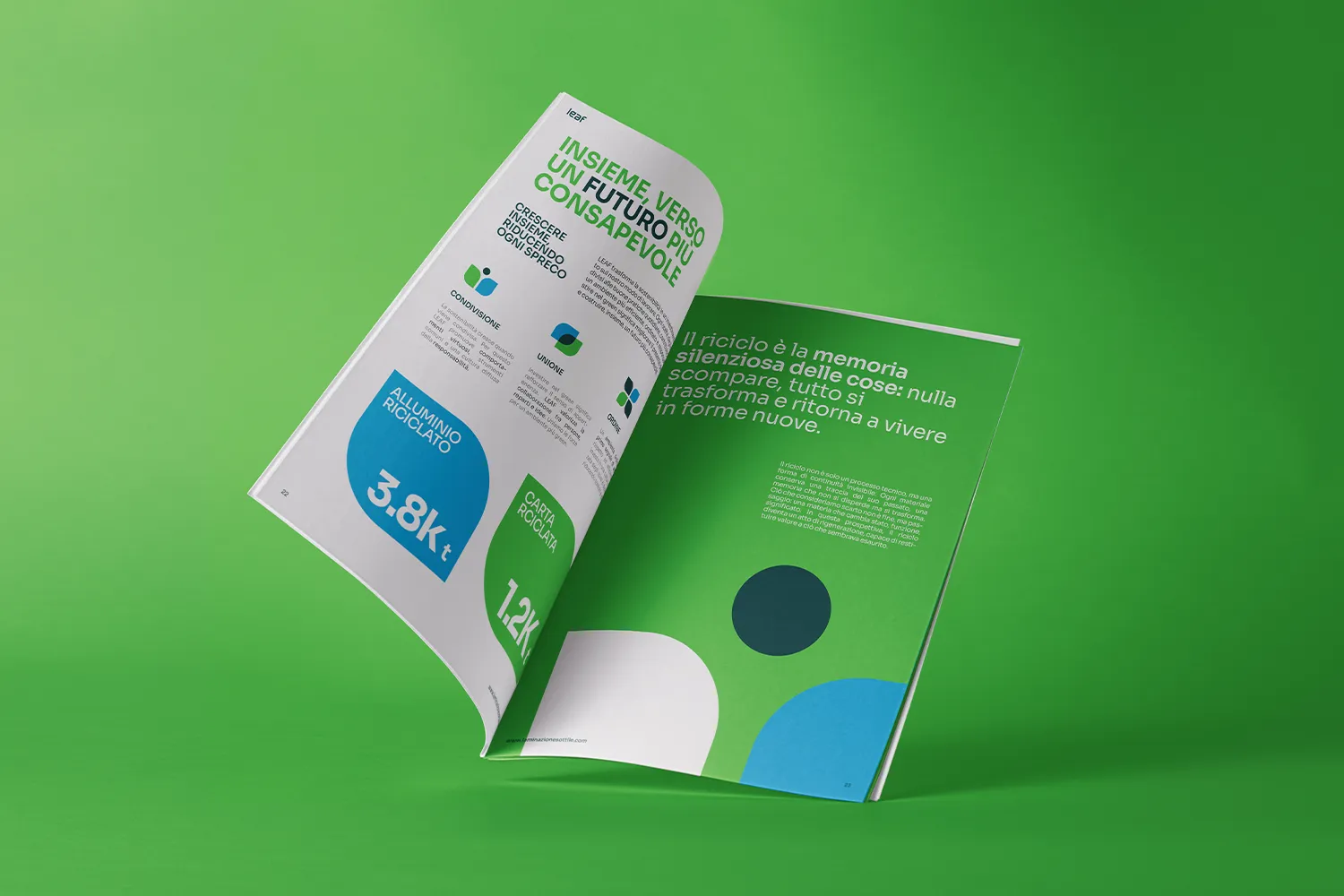
Because changing a culture isn't a campaign — it's a season. LEAF gives Laminazione Sottile's people a shared language for that change: one that starts from a single seed and, one leaf at a time, becomes a way of working.
The strategic Approach
All of this had to translate into an identity that felt like growth, not obligation. Internal sustainability programs often fail because they preach — LEAF was built to invite instead. Every decision, from the Sora typeface to a palette of radical green, oceanic turquoise and deep blue nature, was made to feel modern, clean and alive, deliberately steering clear of the tired clichés of corporate green communication: no stock recycling bins, no staged smiles.
Because changing a culture isn't a campaign — it's a season. LEAF gives Laminazione Sottile's people a shared language for that change: one that starts from a single seed and, one leaf at a time, becomes a way of working.

Latest projects
Branding
Naming
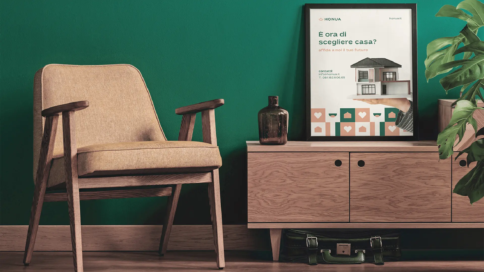
Honua — The Real Estate Agency You Can Trust
Complete brand identity for a new real estate agency built on 20 years of experience and one simple idea: honesty.
Branding
Naming
Honua — The Real Estate Agency You Can Trust
Complete brand identity for a new real estate agency built on 20 years of experience and one simple idea: honesty.
Branding
Naming
Packaging
Grisea — Responsible Skincare Done Right
A complete brand launch for a B2B giant entering the consumer market. Naming, identity, packaging. From scratch.

Branding
Naming
Packaging
Grisea — Responsible Skincare Done Right
A complete brand launch for a B2B giant entering the consumer market. Naming, identity, packaging. From scratch.
Latest projects
Branding
Naming
Honua — The Real Estate Agency You Can Trust
Complete brand identity for a new real estate agency built on 20 years of experience and one simple idea: honesty.
Branding
Naming
Packaging
Grisea — Responsible Skincare Done Right
A complete brand launch for a B2B giant entering the consumer market. Naming, identity, packaging. From scratch.
