
Sistemya needed a brand that could keep up with their growth — modern, digital-first, yet rooted in the world of logistics. We delivered an identity system that works across every channel.

Franz Boccalatte
CEO & Founder
Sistemya needed a brand that could keep up with their growth — modern, digital-first, yet rooted in the world of logistics. We delivered an identity system that works across every channel.
Franz Boccalatte
CEO & Founder
Sistemya is a software house developing applications for complete Supply Chain management. Their flagship product is Armonya — a Warehouse Management System built for the future of logistics. They needed a brand to match their ambition.
Sistemya is a software house developing applications for complete Supply Chain management. Their flagship product is Armonya — a Warehouse Management System built for the future of logistics. They needed a brand to match their ambition.
Creative сhallenges
Sistemya was founded in January 2017. Over the years, the company went through significant changes: the split from Automha in 2020, then DUKA joining the corporate structure in 2022. By 2023, with strong growth underway, it was time for a brand identity that matched where the company was heading.
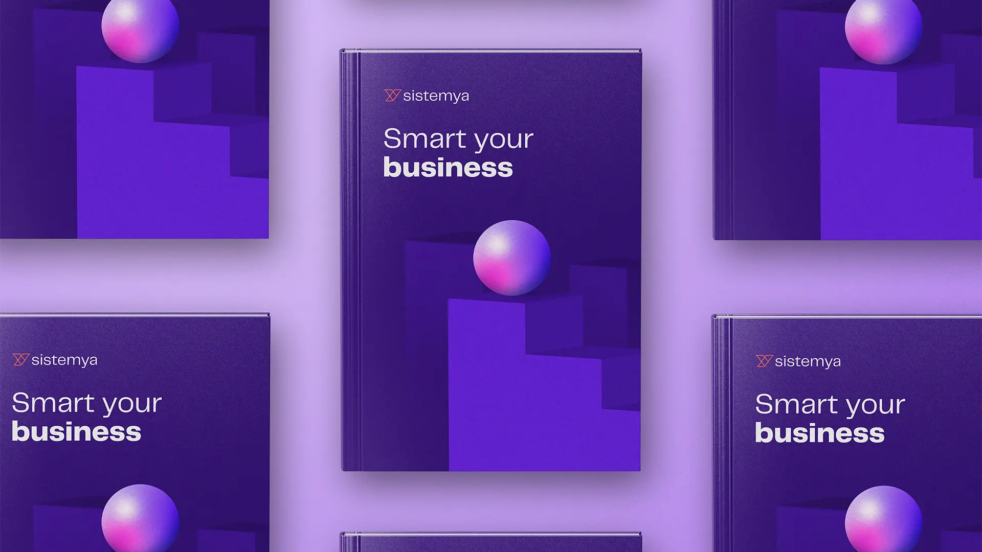
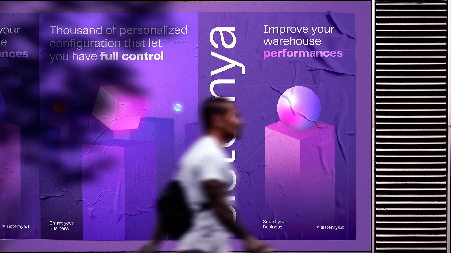
The constraint? We had to keep the existing logomark and logotype. The opportunity? Everything else. We built a bold new visual system using gradients with strong digital colors and two primary shapes: the sphere (representing Sistemya and its innovations) and the cube (representing the world of logistics — pallets, cells, storage units).
Creative сhallenges
Sistemya was founded in January 2017. Over the years, the company went through significant changes: the split from Automha in 2020, then DUKA joining the corporate structure in 2022. By 2023, with strong growth underway, it was time for a brand identity that matched where the company was heading.
The constraint? We had to keep the existing logomark and logotype. The opportunity? Everything else. We built a bold new visual system using gradients with strong digital colors and two primary shapes: the sphere (representing Sistemya and its innovations) and the cube (representing the world of logistics — pallets, cells, storage units).

The strategic approach
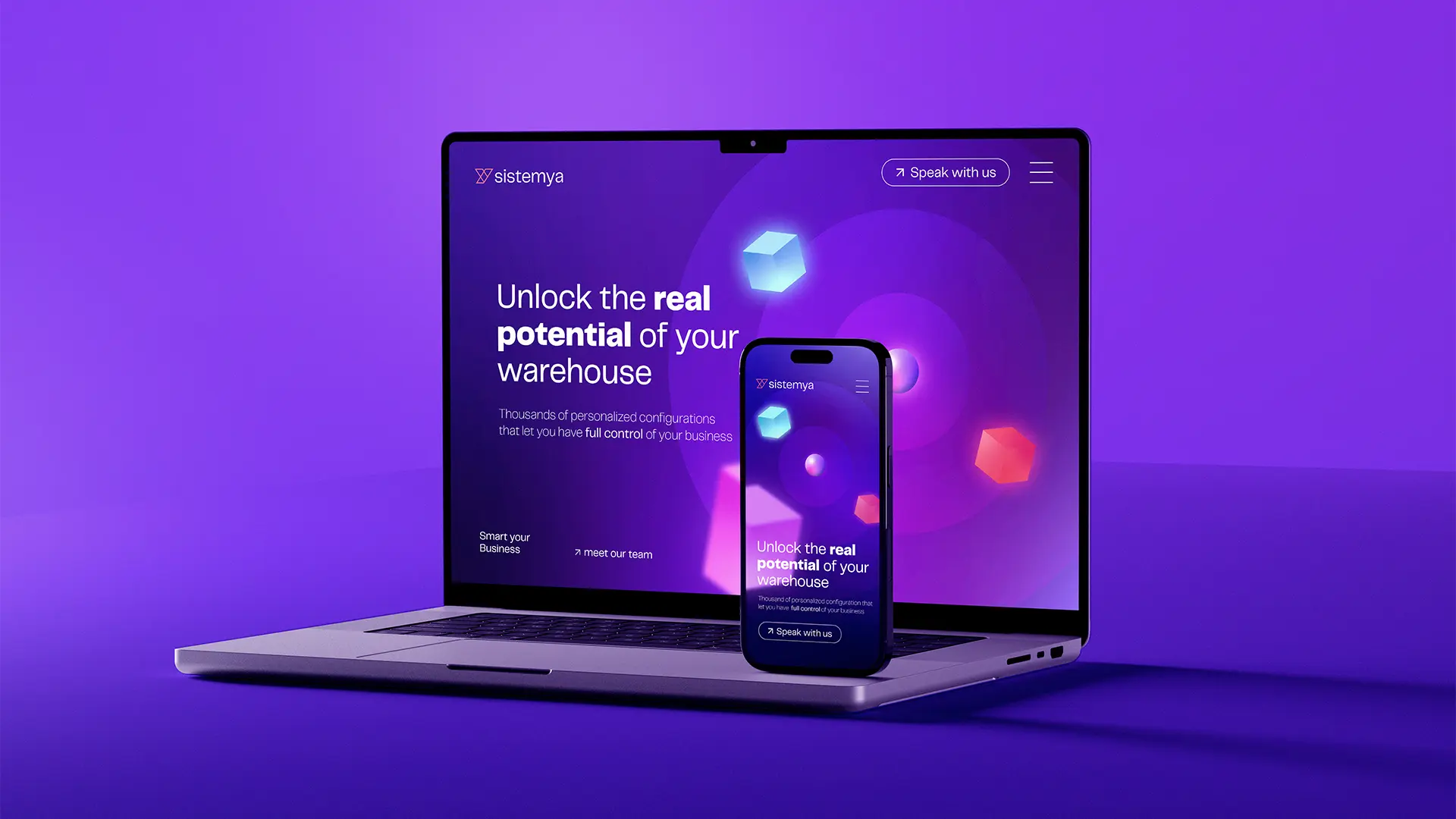
A new way to communicate. In a market dominated by traditional, corporate aesthetics, Sistemya adopts gradients and glow effects as the core elements of its new visual identity. Bold. Digital. Unmistakably modern.
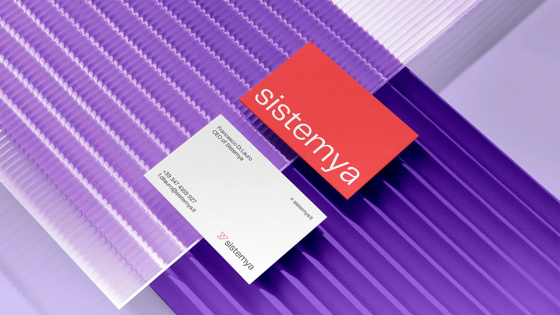
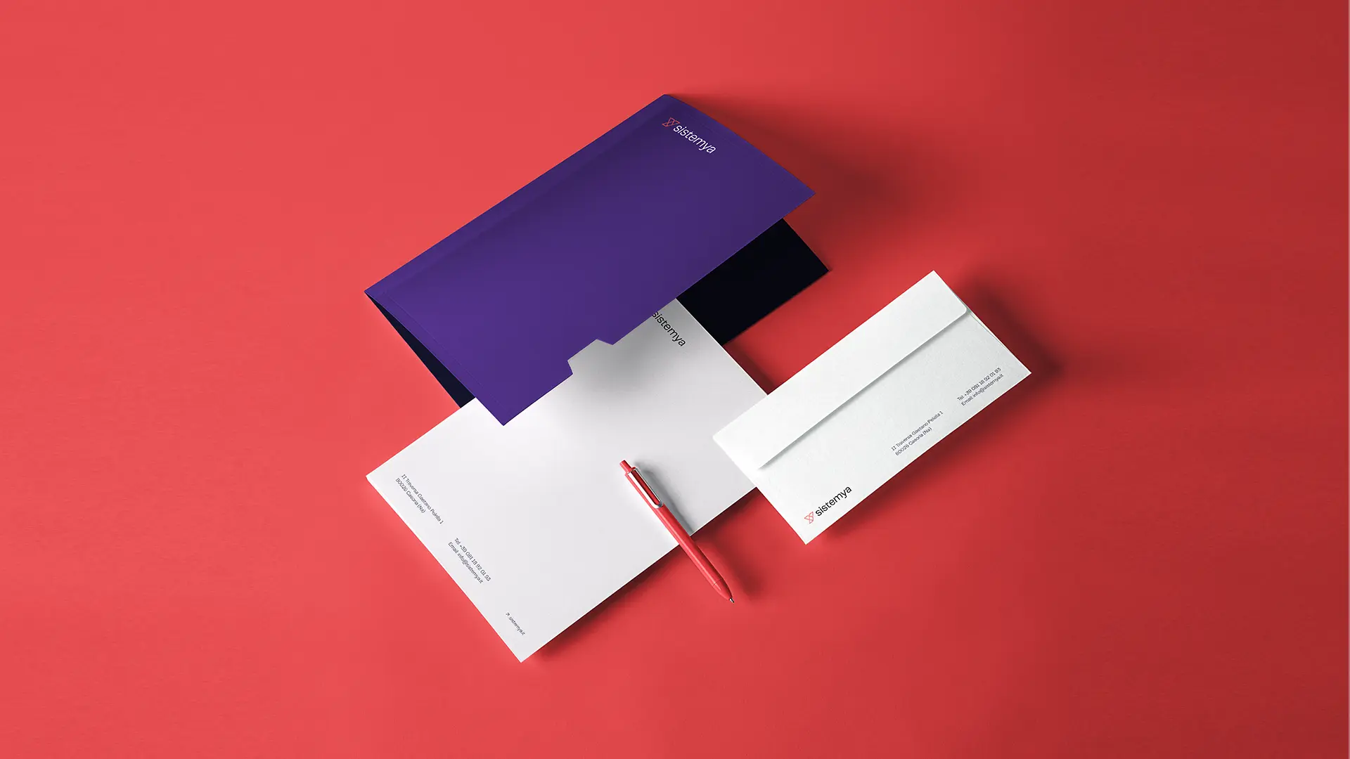
A brand built with multiple visual assets. This allowed us to maintain consistency across all advertising channels and beyond — from digital campaigns to trade shows, from website to product interfaces.
The strategic approach
A new way to communicate. In a market dominated by traditional, corporate aesthetics, Sistemya adopts gradients and glow effects as the core elements of its new visual identity. Bold. Digital. Unmistakably modern.
A brand built with multiple visual assets. This allowed us to maintain consistency across all advertising channels and beyond — from digital campaigns to trade shows, from website to product interfaces.


Latest projects
Branding
Naming
Motion Design
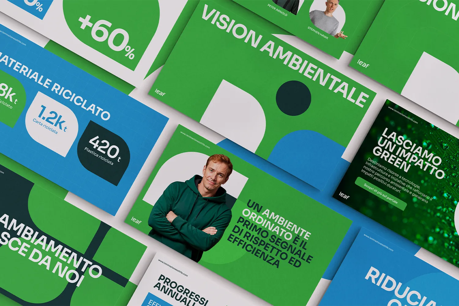
LEAF — A Sustainability Culture That Takes Root
An internal brand experience built to make sustainability a shared value across 1,200 employees — one leaf at a time.
Branding
Naming
Motion Design
LEAF — A Sustainability Culture That Takes Root
An internal brand experience built to make sustainability a shared value across 1,200 employees — one leaf at a time.
Branding
Naming
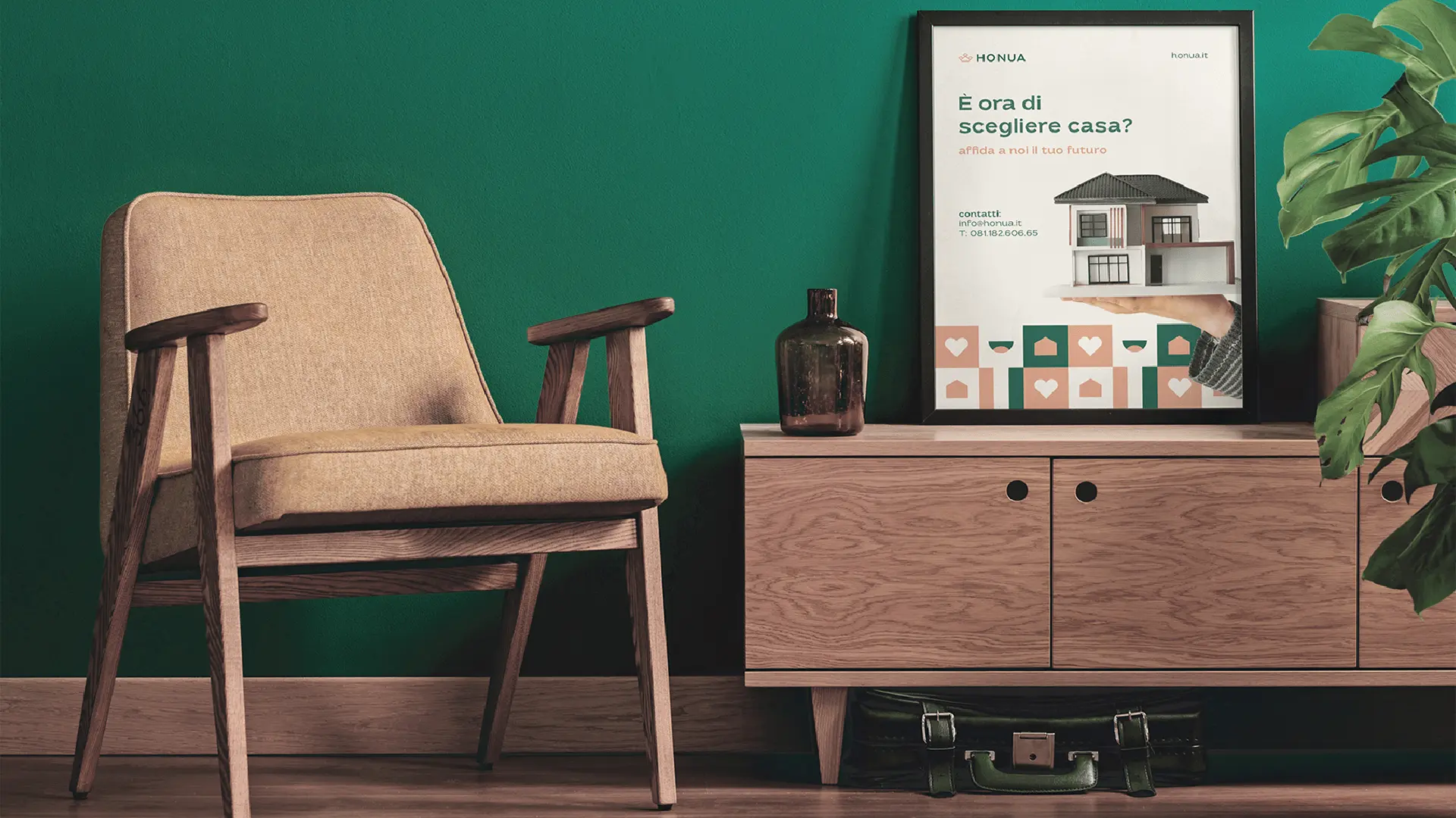
Honua — The Real Estate Agency You Can Trust
Complete brand identity for a new real estate agency built on 20 years of experience and one simple idea: honesty.
Branding
Naming
Honua — The Real Estate Agency You Can Trust
Complete brand identity for a new real estate agency built on 20 years of experience and one simple idea: honesty.
Latest projects
Branding
Naming
Motion Design
LEAF — A Sustainability Culture That Takes Root
An internal brand experience built to make sustainability a shared value across 1,200 employees — one leaf at a time.
Branding
Naming
Honua — The Real Estate Agency You Can Trust
Complete brand identity for a new real estate agency built on 20 years of experience and one simple idea: honesty.
